For centuries, most of us have looked at the world through a map that made Africa appear much smaller than it really is.
Now, something historic has happened.
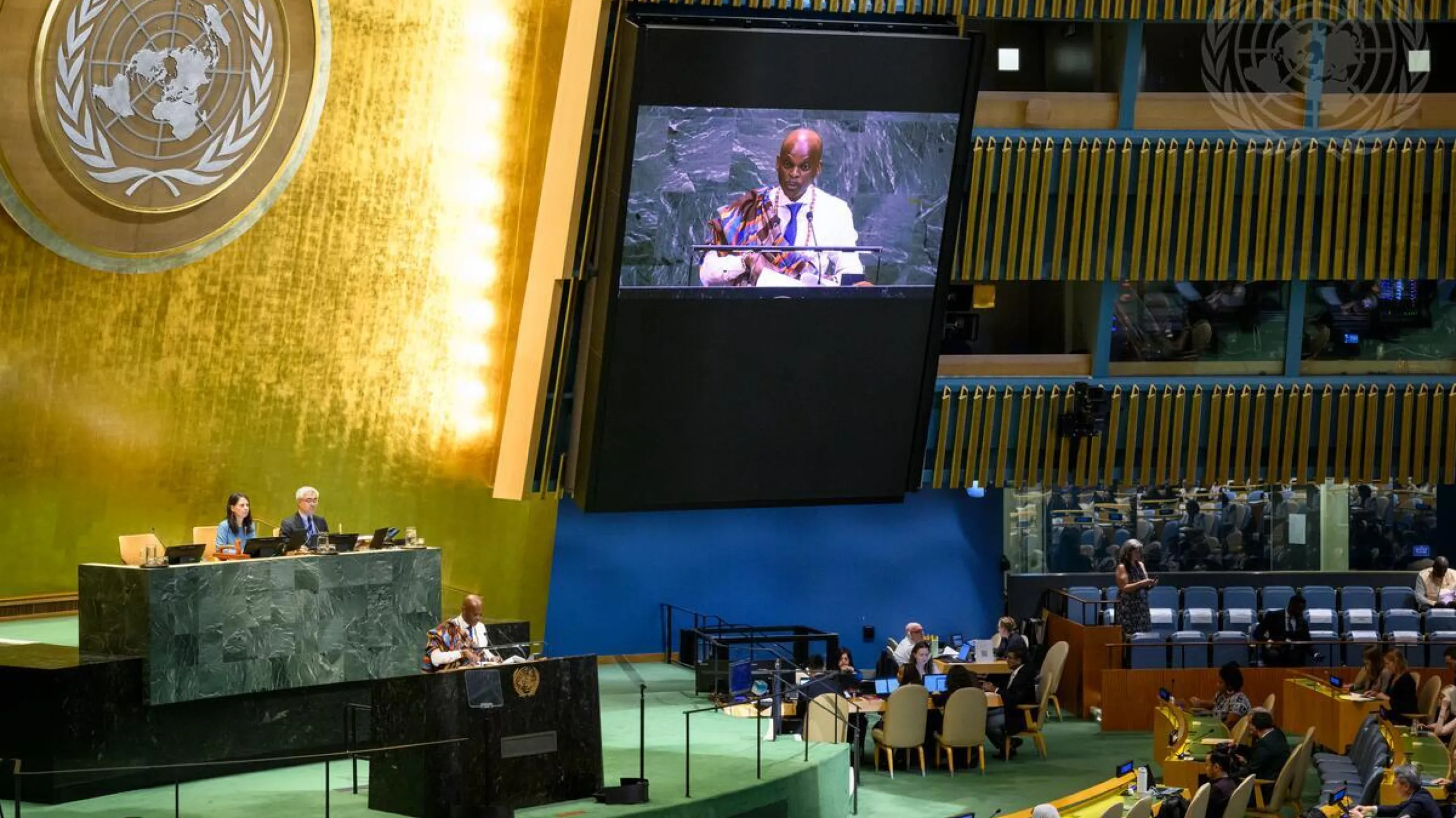
On September 4, 2026, the United Nations General Assembly adopted a resolution calling for a fairer and more accurate representation of the world’s continents — a major victory for an African-led campaign to correct the way Africa is visually represented on maps. The initiative was championed by Togo and supported by the African Union.
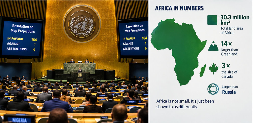
The vote was overwhelming: 164 countries voted in favour, the United States voted against, and six countries abstained.
But what exactly is changing?
AFRICA WAS NEVER ACTUALLY “SMALL”
The problem is not Africa.
The problem is the map.
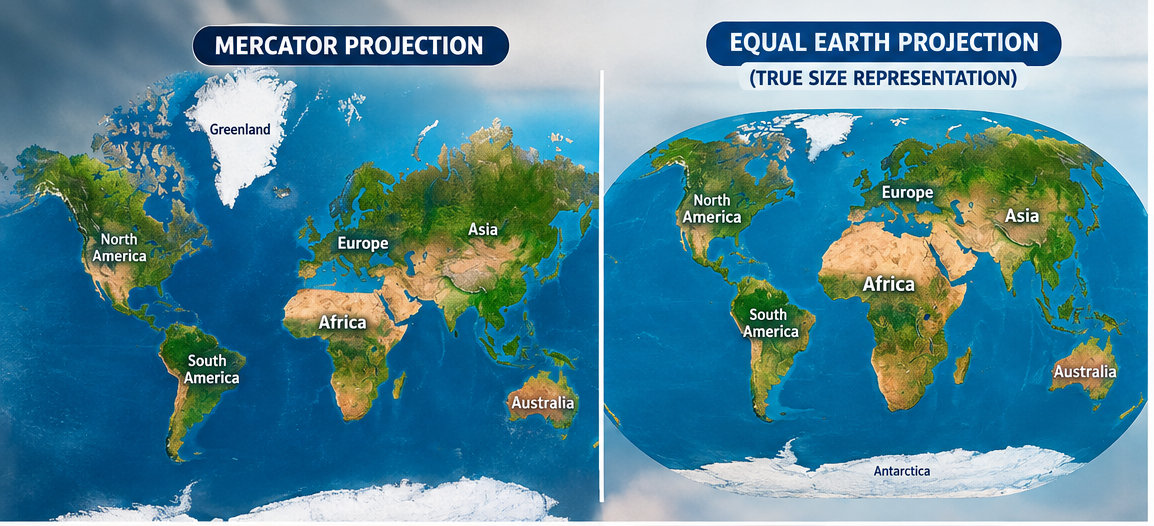
The world map many people grew up seeing is based on the Mercator projection, developed by Flemish cartographer Gerardus Mercator in 1569.
Mercator’s map was brilliant for its original purpose: navigation.
It allowed sailors to plot courses using straight lines that represented constant compass directions. But there was a major trade-off.
The farther a landmass is from the Equator, the more its apparent size becomes exaggerated.
And because Africa sits largely around the Equator, its size is visually compressed compared with regions much farther north and south.
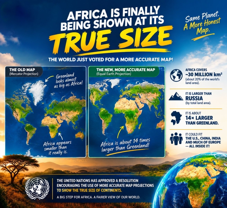
That is why Greenland can look almost as large as Africa on a conventional Mercator map.
In reality?
Africa is roughly 14 times larger than Greenland.
Let that sink in.
Africa covers approximately 30 million square kilometres — about one-fifth of the world’s land area. It is so enormous that the United States, China, India and much of Europe could fit inside it.
Yet on the familiar classroom map, Africa can look surprisingly comparable to Greenland.
That isn’t because Africa is small.
It’s because the projection distorts relative area.
SO WHAT DID THE UN ACTUALLY APPROVE?
This is where the story gets even more interesting.
The UN resolution does not outlaw the Mercator projection.
It doesn’t force Google, schools or governments to immediately throw every existing map into the trash.
Instead, it encourages governments, educational institutions, international organizations, publishers and technology companies to increasingly use equal-area projections when showing the relative size of regions.
One of the projections highlighted in the campaign is called Equal Earth.
Equal Earth was developed in 2018 specifically to provide a visually appealing world map while preserving the relative areas of continents and countries much more accurately.
The African Union had already endorsed the push earlier in 2026, explicitly calling for Africa to be represented according to its actual dimensions.
So this isn’t simply about drawing a “bigger Africa.”
It is about making the visual representation of the planet more geographically honest.
WHY THIS MATTERS TO AFRICA
At first glance, this might sound like a debate for cartographers and geography teachers.
It isn’t.
Maps influence how people understand the world.
Think about a child who grows up repeatedly seeing Europe, North America and other northern regions displayed disproportionately large, while Africa appears comparatively smaller.
Over time, those images can become part of our subconscious understanding of the world.
That is one reason the African Union and campaigners have described the issue as going beyond cartography.
The AU has argued that correcting disproportionate representations is connected to Africa’s place in the global imagination and to correcting historical distortions in the way the continent has been represented.
And this is where the issue becomes bigger than a map.
A map is not the territory. But a map can influence how people imagine the territory.
HERE’S ANOTHER FACT THAT WILL SURPRISE YOU
Africa isn’t just bigger than Greenland.
It is also larger than Russia by total continental land area.
Africa is approximately 30 million square kilometres, while Russia — the world’s largest country — is around 17 million square kilometres.
On a Mercator map, however, Russia appears dramatically larger because of its extreme northern position.
This is one of the strangest things about the maps many of us grew up with:
The world’s largest country can look bigger than an entire continent that is actually much larger.
The distortion becomes even more dramatic when you compare countries near the Equator with countries near the poles.
And that’s the crucial point: Mercator isn’t “wrong” for everything.
It was designed to preserve angles and directions for navigation.
The problem occurs when we use it to judge the actual size of continents and countries.
It’s like using a ruler designed for measuring temperature and then complaining that it doesn’t measure distance.
The tool has a purpose.
We just have to use the right tool for the right question.
THIS IS NOT JUST AN AFRICAN STORY
The change benefits more than Africa.
Equal-area projections also give a more realistic impression of regions such as South America, South Asia and Oceania, which can also appear disproportionately small on traditional Mercator maps.
So the bigger message isn’t simply:
“Make Africa bigger.”
It is:
“Show every part of the world according to reality.”
That is a much more powerful message.
And perhaps that is why the UN vote matters.
The world has acknowledged that when the question is “How big is this place really?”, we need maps that preserve area rather than maps designed primarily for navigation.
TOGO PUT AFRICA’S CASE ON THE WORLD STAGE
One of the most remarkable parts of this story is that Togo took the lead in bringing the issue to the United Nations.
The campaign was supported by the African Union and African states, transforming what might once have been considered a technical cartography debate into an international conversation about representation, education and perception.
Togo’s Foreign Minister Robert Dussey argued that maps influence education, imagination and collective perceptions.
And that may be the most important lesson of all.
Representation matters.
How Africa is represented matters.
How Africa is taught matters.
How Africa is visualized matters.
And now, the world’s most important international organization has officially acknowledged that the traditional way of displaying the planet can give people a misleading impression of relative landmass.
AFRICA DIDN’T GET BIGGER.
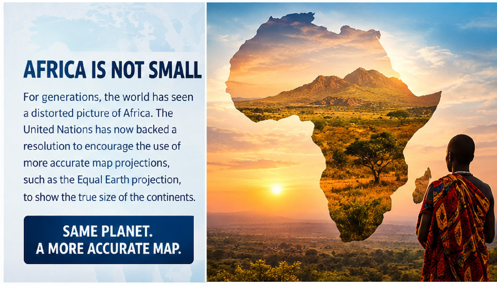
THE MAP JUST GOT MORE HONEST.
Africa was always this big.
The continent didn’t suddenly gain millions of square kilometres after the UN vote.
The Sahara didn’t expand.
The Congo Basin didn’t move.
Nigeria didn’t become larger overnight.
What changed is the international push to make maps reflect what has always been true.
Africa is enormous.
It is the world’s second-largest continent.
It stretches from the Mediterranean in the north to the southern tip of the continent, and from the Atlantic Ocean across to the Indian Ocean.
It contains 54 internationally recognized countries, thousands of languages and cultures, extraordinary ecological diversity, and a population of more than a billion people.
And perhaps now, when the world looks at the map, it will begin to see the continent with a little more geographical accuracy.
The UN’s decision doesn’t instantly replace every map on Earth.
But it represents a significant step toward changing what appears in classrooms, textbooks, institutions, media and digital platforms.
Africa didn’t become bigger today.
The world simply took another step toward seeing how big Africa has always been.